


The Story of Our Logo
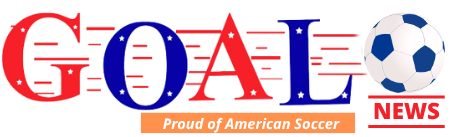
The story of our logo is not cut and dry like we just used a software and created it. No, Goalnews logo was created in a lightning second of frustration when I was explaining that all work, investment, design we created was going to trash. Another company had a similar logo, and it was printed in their advertising.
The words’ goal and news are very common, generic. You cannot patent it.
But you can create a product out of it, like in our case putting them together to form Goalnews, meaning a “magazine”. Goalnews is different, it is not a verb and is not generic, is not a noon. In designing our logo, we substituted the letter “o” in Goal by a soccer ball considering that Goalnews is a soccer only news magazine. Researching before use and launch we discovered somebody had the same idea.
I was covering a soccer game at now gone “Orange Ball” in Miami, and talking to two friends, Munga Eketebi and Adam Schwartz. Munga asked me how about the logo and frustrated I answered was ready, but we can’t use it after all hard work.
I explained that another company had the same idea, and it was before us so we couldn’t use it, so I trashed it. My two friends’ reaction: – “Oh!” – What are you going to do? Back to square zero, no magazine?
Out of pure frustration for money, brainstorm, time and more lost, I scribble the Goalnews on the notepad I had to cover the game saying that I will kick the ball putting some dashes of wind over the word and the ball on the end.
My two friends again in unison: – “I like it!”
I covered the game and did not think about it. Back in the office after writing and sending the article to the agency, I appreciated the scribble, and they are right, was an innovative idea. Using the colors blue, red and white to symbolize American, Goalnews covers specifically U.S., men and women, soccer, and stars to represent the people that make soccer great in American.